
I have a list of upcoming events, and I think you'll be excited. This year we've been branching out in what we teach and offer. So, classes over the next few months are really covering a wide gamut of topics. Look for classes on Fine Art as well as for Papercrafting (Click on our
classes page to see all classes offered)
Papercrafting classes - 2016
Whimsical Faces & Hair $99
Vintage Values & Monotones $99
Sept. 9th Charolette NC
Sept. 23rd Las Vegas, NV
Sept. 23rd, Sacramento, CA
Oct. 14th, Boston MA
Oct. 14th Hanover, MD
Oct. 14th Portland, OR
Dress for Success, Clothing & Accessories
Sept. 10th Charolette NC
Sept. 24th Las Vegas, NV
Sept. 24th, Sacramento, CA
Oct. 15th, Boston MA
Oct. 15th Hanover, MD
Oct. 15th Portland, OR
Note if you want to take all 3 workshops in a location, we offer a
package discount HERE.
New! Fine Art Workshops 2016
Fine Arts 101 class-
This is a basic overview of using Copic markers, from blending to paper choices. No experience necessary! Lots of great content, offered in a couple locations coming up soon. Only $99, classes run from 9am to 1pm
Sept. 10th Phoenix AZ, Taught by Jennifer Dove
Nov. 4th Dallas, TX, Taught by Ryan Weber

Fine Arts: ThINKing Outside the Box
Use a limited color palette to make amazing mini masterpieces. No experience necessary! $99, 2 to 6pm.
Sept. 10th, Phoenix AZ, taught by Jennifer Dove
Fine Arts: Portraits with Copics
This is a mid-level class that goes in-depth on how to acheive more realistic portraits with Copic markers. Learn how to achieve good skin tones, and more $99, class runs from 2 to 6pm
Nov. 4th Dallas, TX
Papercrafting Classes- 2017
Standard Certification
Jan. 18th 2017 Phoenix AZ
Coloring Flowers with Copics
Jan. 18th, 2017 Phoenix AZ
Intermediate Certification
Jan 19th, 2017 Phoenix AZ

New! Hand Lettering with Copic $120
Jan. 20th 2017 Phoenix, AZ
New! Copic Coloring Animals $99
Jan. 21st 2017 Phoenix, AZ
Coloring Landscapes with Copics $99
Jan 21st 2017 Phoenix, AZ
Conventions
We have booths at many events this Fall. If you are nearby any of these upcoming locations then stop by and check us out!
Sept 9-11th, Rose City Comic Con, Portland OR - Comic convention
Oct. 8th, Main St. Stamping, Portland, OR - I'll be teaching Copic coloring workshops
Nov. 4-5th, Pinners Convention, Salt Lake City UT - Hand lettering, coloring, adhesives, home decor paint, and more
Nov. 11-13th, Eucon, Eugene, OR - Comic Convention, we're hosting live art demos and ongoing workshops
Nov. 16th - 17th, Tools of the Trade, Eugene OR - I'll be doing free, live coloring demos
Nov. 18-20th, CTNX, Burbank, CA - Professional artist gathering, we'll have workshops and demos
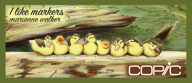
 In the meantime, I have been drawing and coloring a wide range of beautiful images. I'll post a few just to give you an idea. These are more of my complex drawings, so I won't go into the colors used, as it was way too many to keep track of!