Tuesday, March 31, 2009

Shading on a Narrow flower

A long, narrow flower blossom is basically a cylinder, so let's adapt the shading that we discussed in the last post to shading a flower.

Lighting on a Narrow Blossom
I was Googling something and I came across a delicate little purple flower. In looking at it I saw that each blossom was long and narrow, much like the cylinders we were discussing earlier. So I decided to draw the bloom and we'll color it using what we learned before.

First, as with any of our artwork, we need to pick a light source. Once again, I drew a diagram of two blossoms to better understand my shadows.

Each bloom got a basic shadow on the far side from my light source. Then, where the top blossom shades the bottom flower there is an extra shadow. Next, we look at the inside of each bloom. Note that the cylinder is hollow. On the bottom bloom we know that it will be in deep shadow because all light is blocked and it is such a tiny area that no ambient light can work it's way in either. The top blossom is a little trickier. We need to imagine where the top petal shades inside, but the bottom petals still gather sunlight at full force.

When we apply this to our artwork you can see that the first layer of coloring defines basic shapes- Sky, stem, and flowers. There is no contrast yet and so there is nothing very interesting about this picture.

This cluster of blossoms gets a lot more complicated than my simple diagram above. Now I need to look at each blossom individually to find the shadows. A good place to start is with things we know will be deep shadows- flowers on the far side of the bloom, and then each cylinder individually.

As you can see from the second layer of shadows in BV13 I was able to define each bloom, but when put together they fit as a whole cluster. This is a lot more exciting than the flat colored area of the first layer. Note that I add my darker color in feathering strokes that follow the direction on each petal. If I were to go the opposite direction it wouldn't look right. The petals also have natural ridges in them that flow along their length, so if I have streaks I want them to accent natural elements.

It still doesn't look quite right because we haven't gone in with our final layer of shadows.

For my last layer of color I added V17. Again, I streaked it in same direction as the middle purple. I used much less V17 than I did BV13, but look at how much more exciting the flower is. Look at how deep the purple is in the center bloom. It is dark because we know that the flowe is a long tube and deep inside the tube light will be blocked, so this area gets my darkest purple. The yellow center sticks out into sunlight, so it stays bright. If it were deep inside then I would color it a shadowed yellow.

I could stop at this point and my bloom would look great. However, I'm a bit of a perfectionist. I want my colors to blend smoothly into each other, and I still have some shadows to touch up. My last step is to smooth and darken one last time. Following the direction on each petal I went in with BV000 and blended the light, middle, and dark together in a more natural way.

Blending without the Blender
On my final image I did not use any colorless blender. Why? Because my pale purple is already the shade I want my highlights. Since the whole flower is purple I can go back over any areas that need smoothing over with the BV000. This acts like my blender- it smooths all the purples together. However, it does not lighten up any areas so I am not fading my rich purples out to white. Use the blender only when you need to fade to white or a color is too dark.

After I smoothed all my colors together I went back with my middle purple, BV13, and I added some directional streaks back into each bloom. I also added a bit more V17 to deepen the darkest shadows one more time. Now my final cluster is richly colored and looks more alive.

I drew these little blue wildflowers with a 0.1mm multiliner onto color laser copier paper. I looked at about 10 different photos online to really get a feel for the look of these flowers before I tried to draw them. This way I'm not copying a specific photo, rather, I am creating a composition using elements I saw in many photos.
Monday, March 30, 2009

Certification update

Kingsport, TN class on April 19th is full. However, there are still lots of spaces in the other classes. Also, the Chino, CA class on April 26th will open to the public on Friday.

Saturday, March 28, 2009

Shadows part 10 - Shading a cylinder

I was coloring something earlier and I got to thinking that in all the shadow posts I've done, I haven't spoken about cylinders. This is important once I get into coloring hair and other complex objects. You should review lighting on spheres before you learn about cylinders.

Lighting on Cylinders
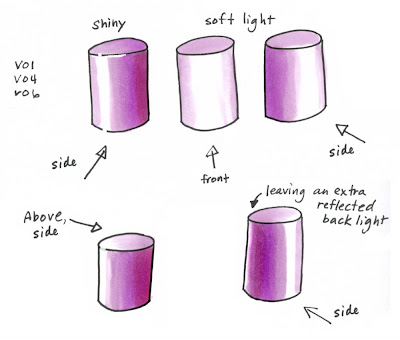
This is pretty basic. On the side closest to the light source leave it white, then have it fade out from there, getting darker on the far side. I picked 3 colors in a sequence to give me my light, middle, and dark values- V01, V04, and V06.

When you are coloring a cylinder you need to keep all your marker strokes flowing up and down along the straight edge of the cylinder, particularly on shiny shapes. A reflective cylinder distorts light tall along it's height so if you have lots of little strokes running the opposite direction it will look a little odd (it can be done but for simplicity sake it will look better if you keep your streaks in one direction).

Shiny objects will have a crisper, stronger contrast between light and dark, as will smaller or more directional light sources. You can also see that I broke up the strong black outline with some Opaque white to really pick out the reflective highlights.

Soft or diffused lighting will give you a much gentler gradient from light to dark. Note how you really lose all deep shadows when you have soft light from the front (more on this in a moment). Another common way that we see cylinders is with a highlight on the backside as well. This is a reflection of ambient light, or light all around us. Sometimes I leave a back reflection, other times I don't. It's a matter of personal taste in the exercise today.

The basic cylinder shape is carried over into many everyday objects, from poles to cups, bottles to human limbs. Once you master adding shadows to a sphere and a cylinder (and a cube which we haven't discussed yet) you can color just about anything and you'll know how to adapt your lighting accordingly.

Simple shape diagram for lighting
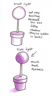
Let's apply this cylinder to a final image today to see how dynamic lighting works on a finished object. This lighting diagram helps you understand the basic shapes involved when coloring this topiary. I draw little diagrams all the time to help me figure out how to do my lighting- I break a complex object down into it's simple shapes so I can understand it better.

Many people start coloring with just general shadows- darker on the edges, light in the middle. This is correct if the light is coming from directly in front. Notice that it's not very exciting. There isn't much contrast between highlights and shadows and you wouldn't see a ground shadow because it is hidden behind the plant.

If we turn the scene so that the light is coming from one side it suddenly gets a lot more exciting. We see dark shadows and highlights. Although this is harder to color it makes the final artwork much more dynamic and alive. I also added a hint of a ground shadow. This gives our plant something to rest on or a good foundation so it's not floating in space.

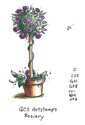
Using the lighting diagram above I colored my final image. I figured that since I just got back from a fabulous trip to Canada I should use a fabulous Canadian stamp. This is the stamp "Rosiary" by GCS Artstamps, stamped with Memento Tuxedo Black ink.

Notice how the greens and purples on the top sphere of plant are dark on the far side and you can really tell that it is a ball of plant life. If I had colored this with shadows from the front it might be harder to tell it's a sphere since the shadows wouldn't clue me in as much.

The flowerpot is getting a nice soft light but you can easily tell which direction the light is coming from. We really get a sense of volume and depth just by having our shadows from one direction. I hope this helps you break a rut of coloring things all in the same way, have a great weekend!

Thursday, March 26, 2009

Back from A Long trip

I apologize for being missing for so long. I'm still not entirely sure I'm really here again. We taught 4 certification classes this week and my mind is still in a blur. Thank you to all the fabulous crafters we met this week.

I need to update the upcoming Certification classes. Each class is $120 and runs from 9am to 4pm. No supplies needed, since you will walk away with a whole pile of neat stuff and ideas. Check dates and locations below for upcoming events-

• Now open to the public •
e-mail me for applications office1@copicmarker.com
Savage, MD April 5th Taught by Sally Lynn
Kingsport, TN April 19th Taught by Sally Lynn
San Francisco, CA April 22nd Taught by Marianne

• Upcoming, contact me for applications •
Chino, CA April 26th Taught by Sally Lynn
Rockland, MA May 17th Taught by Sally Lynn
Smithville, OH May 31st Taught by Sally Lynn
Winnipeg, Manitoba, CA June 6th Taught by Sherrie Siemens

• Applications going out soon, sign up on the sidebar to get on mailing lists
Belmont, NH June 14th
Durham, NC June 28th
Orlando, FL July, day before CHA
Portland, OR (May or early June, date TBA) sign up for mailing list
Texas- Dates TBA (Late Summer or Fall) sign up for mailing list
Calgary & Edmonton, Alberta (July, dates TBA) sign up for mailing list

• Canceled •
May 3rd, Rotterdam, NY

I know that there are may places across this world that people would like to see a Certification. While we cannot fit every location in 2009, we are looking at 2010. We try to keep our locations about 2-3hrs apart, so if you live within 2 or 3 hrs. drive of an upcoming city then that might be the closest it will come to you for quite a while. Just know that we feel your pain and want to come visit all of you!

Tuesday, March 17, 2009

Making drops of dew

What a rainy week we've had so far! However, this part of Oregon is considered a temperate rainforest, so we're bound to have our share of rain. In thinking about rain and St. Patrick's Day, I figured now is a good time to bring up wet things. Wet, like a morning rain shower leaving tiny drops on a field of shamrocks.

Adding Dew Drops
You can add drops of rain and dew to any colored area, and I'll step you through that today. What you want to do is color your picture entirely with Copics then with a few little extras we can add drops of water. This is perfect for pictures of spring flowers or on leaves, rocks, or whatever else is out there getting wet.

I started with a rough drawing of clover I made with a 0.05mm Multiliner. I photocopied my line work onto color laser copier paper because I know that I get the crispest special effects on this paper, even crisper than on Neenah. For this technique you will get the best results on paper that has crisp colored edges like the PTI, Neenah, Borden & Riley Marker paper, and such. Georgia Pacific is too soft. onto added two of the same base greens that we were working with last week: G21 and YG03. Background got G21 and the middle layer of clover got YG03. The top layer of shamrocks I want much brighter so I colored them in with YG01.

I darkened the shaded areas with G24 and I darkened the bright yellow green with YG06, a darker bright yellow green. (Be aware that the colors on the screen are highly inaccurate).

I added the deepest shadows with G07 lightly feathered into each leaf, stroking from the middle out. The little jagged edges of the feathering I kept so the whole picture looked more leaf-like.

Next, let the whole thing dry really well. This helps make the special effects crisp. Then I add "drops" first with my colorless blender. I pick spots that I want drops and I just touch the blender there until the color moves out of the way.

To get a stronger "drop" I let it dry then do it again in the same spot. This pushes more color out of the way.

Then, at the top of the drop, I add a glint of white with the Opaque white. Don't go crazy adding drops everywhere, just a few strategically placed ones. I got crazy on the shamrocks on the picture because I wanted a really wet field. A few large drops are probably enough. Drops tend to pool along the edges or ridges on a leaf, so most of my drops are on the outer edges. On small drops I did not add glints of white with the Opaque white, rather, I used a white prismacolor pencil. This gives more subtle highlights. For the darkest underside on some of teh drops I added a tiny line/shadow with a 0.1 mm Olive Multiliner.

If you look at each of the top leaves you will also see lighter "squiggles". This mimics the pattern found on clover and it is just a quick scribble from the white colored pencil. I wish this camera would have picked up the color better, since in real life this picture is much more vibrant and bright.

May the luck of the Irish be with you this day!

On an unrelated note I just wanted to mention that the Savage, MD Copic Certification class on April 5th taught by Sally Lynn MacDonald is now open to the public (if you visit her blog you'll see a list of upcoming Copic classes). I have a few spaces left in my Monday class in Buffalo, NY as well. If you need to apply for either of these clases please send an e-mail to Kris at orders@copicmarker.com Also, if you are interested in Canadian classes there will be many coming up in June and July, so sign up on our mailing list using the form on my sidebar or the form on the Copic website.

I will be out of town until Thursday the 26th, so I won't be responding to e-mails as quickly as usual. Also, my blog posts will be a bit more sporadic, but know that I still care about you.

Saturday, March 14, 2009

Eye Movement

I just wanted to post real quick a diagram of eye movement as it relates to a composition. Review my post on DUMB-V for clarification of how this relates to your work.

Movement within a Composition
The human eye follows certain paths when looking at an object or composition. Straight lines are a natural guide- our eye wants to see where the line ends. Arrows and pointy things also lead our eye in the direction they're pointing.

When you have contrasting colors, or light areas with darker areas around them then these create pathways our eye wants to follow. Remember, contrast attracts us. If your visual pathway is a long strip of light then our eye follows the light line to... well, to whatever is at the end of the line.

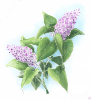
If we look at the lilacs from yesterday the highlights on the leaves pull our eye back into what is important- the two blooms.

Here I've diagrammed out the pathways. The blue arrows lead you to the top bloom, the pink arrows pull you to the bottom bloom.

Most of the visual paths are clear. Our eye follows them and goes where we want it to. However, note the spot where the small pink arrow above the bottom bloom aims down, then you have a strong blue arrow.

This is conflict. Our eye was following one path, not a very strong path, but then it got interrupted and is shown a much stronger path. What should I do?

In the future, I would probably color the far leaf with less highlight, since it's such a small area anyways. Then the visual pathway would not be cluttered. In this case, I don't mind very much because the conflict is small. The pink arrow is weak and the blue arrow is strong. A real conflict would be two strong elements colliding.

If two elements collide then you create a focal point. If that focal point isn't what you want important then you have a problem. Big circles break lines- there's no place for your eye to go once it hits a circle (think a bulls-eye). Small rows of circles become a repeating element and then become a path.

If two elements meet up and flow together then you are just reinforcing a path. If you follow the bottom most pink arrow - it pulls you to the bottom of the bottom bloom then you bump right into a strong blue arrow pulling you into the top bloom. This is good composition. Your eye ends up traveling the whole length of the piece.

Another visual pathway which I did not diagram out is the stem. See how it flows into each of the blooms. This is a much more subtle path, but a visual guide nonetheless. When you are working on a project you might want to figure out visual pathways. If there is a spot on your composition that does not help the pathway or it draws your eye away from what's important then consider how you can change the colors to lessen the conflict. I try to take these things into account when drawing my artwork in the first place so that coloring it in reinforces what my lines were guiding already.

I don't want you to over-think your work, but I'm just trying to help you understand how to make things look better. Have a great weekend!

Friday, March 13, 2009

Coloring Lilacs, part 2

This is a continuation of my 9th part on shadows, though this time I'm just going to step you through the colors I chose and the rest of my coloring process. This is actually straight forward from here. I hope you find it useful!

Coloring Lilac Blooms
We already talked about the hardest part of this composition, choosing our lighting and picking our greens. Now for the rest of the process.

The lilac blooms were colored with a base of V12. I chose this color because it's called "Pale Lilac" and I wanted to see how accurate it really was. Sure enough, I like it for a pale base color to my blooms.

Notice that I left white between the buds on the blossom. This is because I will be filling in that background area with a more grayed purple base so it doesn't compete with the buds which will get full lighting and are more important.

I darkened the center of each individual bud with V04 because that color is"lilac". Again, I liked it. Way to go Copic! Two colors that look exactly like what the name says they are.

Next I filled in the white between blooms with V91, a very light but gray purple. This gave a base purple tone to the back, over which I added C3 to darken up the shadow areas. On the underside of the whole bloom I shadowed with the C3 then to deepen up the purples under there I used hints of V17.

Finishing up Lilac Leaves
I know it is hard to believe, but I only used 4 colors and a blender on these leaves.

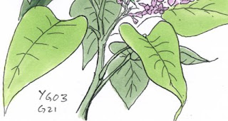
Look at the bottom bright green leaf. I colored first with YG03, added G21 and YG09. the middle vein is darkened with a little G28. Once I've got the whole leaf shaded, then I add the shadow from the leaf above it with G28 for that deepest green.

If you look at the top curled leaf you'll see that I started with my shadows too soft. I kept softly mixing G21 and G28 and hints of YG09 and layering it until I liked the shadow. Each time I darkened the bottom leaf I added more darkness to the top leaf until finally I darkened it to the point of being straight G28. That's when I added the shadow to the bottom leaf.

Look at the leaf in the background. I started with the leaf and stem flatly colored with G21. Then I gradually darkened it with G28. Notice how I kept the stem lighter than the back leaf. Also, I didn't just darken the back leaf all the way to pure G28 like I did the shadows in front, nor did I give it much more than flat coloring. Why? Contrast is visually interesting and it pulls your eye in. If I had a background leaf that had too much contrast or too much shading then it would detract from the front. By keeping those leaves more flat and dull your eye naturally floats over them and back into the more interesting parts of the flowers.

When adding shadows it helps to step back every now and then and hold your artwork at arm's length and squint at it. I know I've said it before, but it helps you to see if your picture is too flat or if you are really seeing the shadows. It will look bad if the shadows are fake and too dark, but it will also look flat if you don't have deep enough shadows.

If you compare the original value study to the final artwork you will see that I was pretty accurate to my plan. In fact, I overlaid the two in photoshop, and there was so little difference that I didn't save it because there really wasn't anything to see.

This shows the value of a good value study :). If you've done it correctly then you don't ahve to think as much about your shadow placement in the final piece.

Finally, here is the finished Lilac branch. Notice that I added BG000 to my sky. This helps give my blossoms a sense of place. If you leave it white the blossoms have no foundation or reference points- they're just sitting there. By adding a subtle blue sky we assume that the blossoms are outside, the sun is shining, and it's a lovely spring day. Blue is also a natural background color that feels far away. By keeping the blue pale and subtle it doesn't detract from the whole (also, by adding a background color it helps cover up any mistakes you couldn't erase completely).

Wednesday, March 11, 2009

Shadows Part 9 - Shadows in a Composition

Yesterday's post was a warm-up for today and tomorrow's image. I don't want to overwhelm you, but I will label this advanced because a full lilac branch is very complex. I'll try to break my steps down as easily as possible. I strongly suggest that if you did not follow my series on shadows last year that you read through them before tackling this tutorial (first parts 2, 3,)

Planning Shadows in a Complex Composition
At first glance we see a simple image, two lilac blooms among the leaves. We can color it very simply, with purple for the blooms and green for the leaves. Overall it would probably look fine, though it would be very flat. So we start looking at how to add shadows, then we see that this lilac bush is very complex and we get overwhelmed. How can we add shadows and not panic?

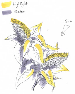
The first step when attacking something like this is to do a quick value study. I keep it to 3 values for simplicity sake: Highlight (yellow), midtone (nothing), and Shadow (gray). I choose my light source and I look at each element individually. On a rough copy of my artwork I plan where my lighting will be. Once I have a light source I go element by element. Things closest to the light will get highlights. Far sides will get shadows. The underside of leaves will be shadows, the tops will be highlighted. Then I can use this lighting reference as a map for coloring.

I could have chosen my light to come from the top left. Picture how the shadows would change: the tip of the top bloom would be very bright and the bottom bloom would have been shaded by the leaves. That would look cool, too.

But how/why did I chose where to put my light today? I strategically choose so that my viewer will be pulled into the image how I want them to...

Strategic Coloring
This means I am in control of the picture and I am choosing how to color it for a reason, not just picking colors and lighting at random. For a strategically colored composition I am choosing my lighting so the strongest contrast will fall on the most important elements of the image: the two large blooms. I want the sunlight to come from the side where both blooms will get the strongest sunlight and more of the less important elements (the background leaves) will be in shadow. If my light were coming from the top left then only the top blossom would be important and the other would be shadowed. It would look good, but not what I feel like today.

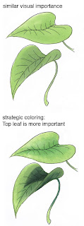
Leaves are green and can be either warm or cool. Yesterday I showed how the top leaf was warmer and brighter, while the bottom leaf was cooler and shaded. It's easy to tell that the top leaf is more important. If I had colored them both exactly the same then they would have had the same visual importance. This is not being in control of the artwork, this is just coloring in something.

If you remember back to some earlier discussions on shadows (part 6, 8) then you'll know that cool colors recede and warm colors are close. I want the most important things to feel close and I want my shadowed leaves on the far side of the branch to feel far away. Yesterday we knew that both leaves were on the same visual plane, meaning that they were equal distance from our eyes, except that one was above the other spatially. This is why both got the same YG undertone.

The final step of deepening shadows increases the visual importance when things are on the same visual plane. Huh? Read it a couple times. When you strategically darken the shadows on two things that are both the same distance from your eyes then you are using the shadows to tell your viewer what is important.

In this lilac branch we have leaves that are far away and the underside. I don't want those to feel like they are on the same spatial plane, so unlike the leaves yesterday I DON'T color them with a base of bright YG, I color them only with G21.

Already you can see from the base tone only that the leaves in front are more visually important and the branch and background are far away and not dominant. I haven't even added shadows yet.

This is where my smaller leaf color studies yesterday are important. I know that I'll be coloring each leaf using the YG03 family and G21/G28. Becasue the G21 and G28 are going to be used on both leaves in front and leaves in back then it's OK if I don't use the YG03 both in front and back, since the other colors will tie in the background leaves.

I know that I will want the blossoms to be most important, so the leaves around the blossoms should be the most interesting and the leaves away from the blossoms should fall away into the shadows. I will plan accordingly and have my brightest areas pull your eyes back into the blossoms, while background colors will have less contrast and have less YG03, more of the G28.
From my final image you can tell that the entire branch is well lit and on the sunny side of the bush. It's very balanced compositionally, and your eye flows through the whole.

If I were to have colored it so only the top bloom was well-lit then the movement and balance (M, B from DUMB-V) would be that all attention flowed to the tip of the top bloom. This would be totally appropriate if I had a focal something there, say a butterfly perched on the top bloom. I'd want the butterfly to be most important, so I'd have all colors pull your eye towards the butterfly. If I were to use the final lilac with other exterior elements in a layout then maybe I would want only one bloom important so it would pull your eye into that object.

I'll save the rest so I don't overwhelm you today. As a teaser of the final image I'll show you the backside, which looks more like watercolor and is just as beautiful as the front.

I drew my lilac with a 0.1 mm Copic multiliner onto Color laser copier paper and photocopied it before coloring it. Because the paper is so thin it takes very little ink to evenly soak the paper and the backside looks very rich and vibrant. You can easily see the final lighting and tell which leaves are close and important and which ones are in the back and complimenting the foreground elements.

Tuesday, March 10, 2009

Basic Spring Leaves

I think I'm on a green fling this week. Fitting, since St. Patrick's day is coming up. I wanted to talk real quick about leaves so that I can move on to the second part which is much more exciting.

Basic Leaves and shadows
As I mentioned yesterday, there are many shades of green and each has a different feel. As Spring gets closer new leaves bud from dry branches and blossoms appear. Growing up I had a giant Lilac bush outside my bedroom window. I love how it grew beautiful lilacs and perfect little leaves each spring. Today I want to color just the leaves of the lilac bush and then we can move on to a whole branch.

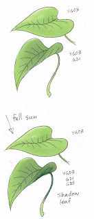
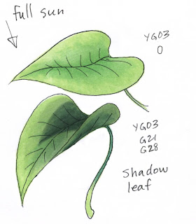
New Spring leaves are young and warm, so for these lilac leaves I am choosing a base color of YG03. I color the whole area of both leaves to give the bright warm green tone that will set the mood and feel for the entire picture.

Since the top leaf is relatively flat it will not have much color variation from the sunlight. However, I lightened up the edges slightly with a colorless blender just to give it a little visual interest. I think I also added some tiny hints of YG06 but I forgot to write it in.

If the bottom leaf were totally flat like the top leaf it would be an overall brighter green just like the one above it. However, because the bottom leaf is sitting at an angle from the sunlight it will be more shaded and look less intense. Also, we see the curled edge revealing the underside. From the angle of the sun we know the underside will be in shadow.

I am adding a hint of G21 to all of the bottom leaf except for the outer edge, because that area will catch full sunlight. By using a lighter but duller color (G21 is a 1, vs. the YG03 which is darker) it keeps the color darkness and family of the YG03, but it adds subtle grayness hinting that later this leaf will be in deeper shadow. The two leaves still look natural together. If I were to have colored the bottom leaf all G21 without the YG03 base coat then it would look VERY strange next to the top leaf (try it yourself and you'll see what I mean). Be aware that the order in which you lay colors is just as important as which colors you used.

Slowly I darken the shadow areas. First, I go for easy shadows. I know that the underside of the bottom leaf will be in shade, so I add G28. I didn't have a G24 at home when I colored this or else I would have used that as middle step. Without the G24 I had to blend using the blending on a palette technique so that my pale G21 faded into the much darker G28 smoothly (in this case I just pulled the caked G28 off the inside of the cap with my lighter G21). By using lots of lighter layers that gradually darken it is much easier to get a smooth blend. Also, by starting with both leaves colored with YG03 they look like they are from the same plant, just with different shading.

Last, I add the darkest contrast and the shadow that the top leaf is casting on the leaf below. Again, I use G28 for my deepest shadows. I have to imagine the triangle of the top leaf and how it blocks the light on the bottom leaf. Although the top leaf has a straight edge I need to remember that the bottom leaf curves, so the straight shadow edge from above ends up following the curve of the bottom leaf.

When working on a shape like this leaf which has distinct direction (the veins) add your darker color in strokes that follow the direction of the veins. That way if you make a streaky mistake it will not be as noticeable.

I drew these leaves with a 0.1 mm multiliner onto color laser copier paper then made copies to practice coloring on. These leaves are a smaller study of a larger artwork. Many times I'll work out one element from a larger picture just to get an idea of color, technique, and lighting before I commit to a full illustration. By working on the thin copier paper it takes much less ink to evenly saturate, and the paper is nice and vibrant.

Monday, March 9, 2009

Greens for my Swatch book

I've been working hard this weekend on many projects. One ongoing project that each of you should work on is your Color Swatch Book. As I was gathering my supplies for my next round of Certification classes on the East Coast I realized that my swatch book didn't have many green examples, nor did I have examples of some different types of paper. So I added some pages and I figured you would like to see them this week
By the way, Mystic, CT • Buffalo, NY • Toronto, Ont are all open to the public. If you wish to register send me an e-mail for the application. And, you can now follow me on twitter.

Swatch Book Color Ranges
With hundreds of colors available you really have a lot of swatches to try to find combinations that work for you (click here for a downloadable color wheel and blank chart). Swatch books will reflect the personality of the owner. You'll probably make more pages in your favorite colors and the more you work with your favorite colors the more you'll find combinations using your favorite colors. If you find yourself always reaching for the same 15 colors out of your collection of 50 then you should branch out. Throw in a color you don't use very often to mix it up a bit. Sometimes the results will startle you.

Look through your swatch book every now ant then and see where the color combos are lacking. My color book had mostly blues and browns, because people asked a lot of questions about blues and browns. Also, there are LOTS of shades of blues and browns and it's hard to remember what I've tried.

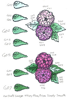
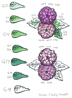
Here is a partially done example page. If you look at the blossoms (I think they're hydrangeas but I can't remember which flower I was drawing at the time) you'll see that I'm also looking at the V000, V01, V04, V05, V06, V09 Natural Blending Family. Each blossom is very different, yet they're all within the same color group. This is why you need swatches.

If I remember from math correctly, for 322 colors, if you are just blending 2 different colors each time then you'll have a possible 103,362 options. (formula: n(n-1). ) If you throw in a 3 color blend, then you have over 33 million combinations! (formula: n(n-1(n-2)). ) That's not factoring in different ink types, paper types, and all the other little things that go into your artwork. So don't feel like you have to write down every color/ink/paper combo out there, just the ones that you find useful.

Greens
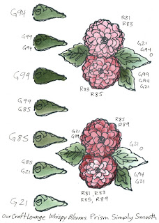
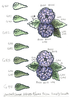
I needed to document the basic green family, so I started from the beginning, with G00. I know that Copic makes a G000, but it's too light for my scanner to pick up, so if you love that color don't feel that I'm leaving you out. Since I am trying to see color combos in Natural Blending groups for this page of greens I prepared it with blank spaces for color swatches on the side, then on the main image I mix up the colors on the side to see different combos and to get a feel for contrast.

Greens are actually pretty easy to find great looking combos. I hesitate to say that any two greens will look good together, but it's a safer bet that they will than guessing that any two pinks will work well with each other.

Since green is made of Yellow and Blue, you can add either of these and also find good green color combos. You can warm up your basic greens with Y, or YG. You can cool down your greens with BG or B. If you want to mute out your greens (turn them brown or gray) then throw in the opposite color, red.

You can see from one of the leaves on my example page I shadowed G85 with V99. Although those colors are totally different, I had used the purple in the blossom and I know that v99 is dark and that cool shadows have purple in them, so I knew that I could add a cool, deep shadow to my green leaf and it would work.

Also compare the greens from the G00 and G12 pages to the greens on the other two pages. Look at how much more vibrant colors from the 00's and 10's are. If youa re coloring leaves in the springtime then they will be more vibrant and warmer, like the 00's and 10's. If you are coloring something from the deep forest, an older plant, or something from late summer then you might want to reach for more muted greens like the G40, G80's or G90's.

When you jump from a base color of G02 to shadows of G99 you will start to see where some greens just don't quite work together. Why? Because G02 is a WARM, bright green. It has a lot more yellow in it. G99 is a COOL, dark green. When you add a warm and a cool it turns to gray/brown. the vibrancy of the G02 would get lost in the dull, muted G99. However, I might be able to get away with shadowing the G02 with a YG, or maybe adding a bit of warm gray, or... I think I have to test more colors first!

Contrast
I know I've discussed it before, but to make an image more eye-catching you need to add contrast. Look at each flower on this page. Which blossoms grab your attention first? Which seem more alive? You'll note that the blossoms which stand out and look most real are the ones with the largest color range.

Any element on these pages that has a color jump of more than 5 digits on the last number grabs your attention more than color combos that are only 2 or 3 digits off. Yet my darkest colors are not overwhelming the picture, rather, they are only for accenting the shadows. Do you see how all the little suggestions I've been giving you are starting to fit together?

The flower with V000, V04, V09 has wonderful richness to it. The blossom with BV00, BV04, and BV09 also really pops off the page. If you look back to my post a couple weeks ago on the basic Rules of Good Design you will see that this contrast is part of M,B and V from DUMB-V. Because of the high contrast this is a more dominant image and a good way of coloring if the flower is your most important element in the picture. Your eyes move to the high contrast areas first. By having a larger range of colors you add varienty to an otherwise flat image.

You really need to experiment on your own, and keep updating your swatch book regularly. I'll try to show you more examples as I work through my book, but remember, colors will look different on a computer than they will in real life. Paper: Prism Simply Smooth, Image: Whispy Blooms from Our Craft Lounge. Ink: Memento Tuxedo Black

Thursday, March 5, 2009

Sepia

It's been a while since I posted a DIY, so for people who like fine inking pens and illustration here is a review just for you.

Sepia Inking
Sepia is a rich, warm brown tone that has a distinctness about it. It is generally recognized as a color utilized for fine art sketches and for old photographs. Many of the old master artists would draw their rough work in either Sepia ink or a similar red-brown colored chalk. The original pigment Sepia was derived from the ink sac of cuttlefish but modern pigment inks are chemically made. Sepia inks are known for their rich brown color and warm feel.

Copic makes 3 different Sepia inking pens. You can get a disposable Sepia Mulitliner in 5 different sizes: 0.05, 0.1, 0.3, and 0.5 mm. I like this style because it has the most pen point sizes. The refillable Multiliner SP only comes in 0.3 mm or Brush Small, but it is a good choice because you can replace the tip if it ever gets damaged, or you can swap out the tip for any of the 7 other large point sizes available for Multiliner SP's. All Copic inking pens are pigment based meaning that they won't fade over time. They are waterproof and acid-free as well.

Copic also has a new disposable fountain pen, the F01 Sepia. This is a fabulous pen if you are used to the quirks of fountain pens and like the classic feel of them. The F01 pens are pressure sensitive, so if you push harder you will get a thicker, darker line. Since these are a traditional split metal nib you need to work on very good, smooth paper or else the pressure will cause the nib to drag and catch on your paper fibers.

If you like Sepia, then Copic has a new kit- The Sepia Ink Pro Wallet. This comes with different sizes of Sepia inking pens, refills, and matching Copic colors to get a good color range when shading.

Drawing In Sepia
Personally, I like drawing in sepia because of the warm, antique feel. If I'm not working on a project that needs to be clean black lines then it's fun to break up my artwork with gray or sepia. Doing rough sketches with the F01 Sepia allows me to have very faint lines and then as I work deeper shadows in I can just apply more pressure. Line variation makes artwork interesting.

If you want to shadow your sepia work I've found that the E30's sequence works very well. On this picture I chose a simple E33 for my shadows and I added pale Y11 to accent my highlights. I like the lighter brown because it doesn't hide my outlines, and the yellow really makes the picture feel light.

When I am drawing a human figure you can see how loose I keep my outlines. This would be the frame work for a much more detailed image. By drawing basic shapes I can get all my proportions correct before I add clothing or other fine details. It is much quicker to do figure studies in rough shapes and worry about details later. If you look online you can see similar figure studies by many of the old master painters and compare the rough drawings to their final work (Here is a study done by Michelangelo for the Sistine Chapel in a sepia colored chalk and the final painting).

I strongly suggest working with basic shapes to any beginning artist. I can't tell you how many times I've done a nice drawing without using rough shapes and when I finish I've made a bad proportion mistake that would have been easy to fix if it were still a rough drawing (I once gave a girl two left feet- oops!). I can take this warm sepia outline to my light table and easily see which lines are my roughs and which are my final choices. On this rough drawing I see at least a dozen things wrong that I can easily change when I go in for my final art.

Stamping in Sepia
If you are a stamper then you are in luck. The Sepia Multiliners are a match for the Memento ink color Potter's Clay. If you need to fix stamped lines or if you want to draw matching doodles around your stamped image then reach for a multiliner Sepia. If you go back over a line then it will darken it, so keep this in mind as you draw your patterns. Since this is a Copic inking pen you don't have to worry about it getting smeared when you go to color over the line.
Stamp Image: Unknown stamp from Japan, Ink: Memento Potter's Clay, Paper: Neenah Classic Crest Solar White 80# Other: Sepia 0.3 mm Multiliner
Sepia Illustration above: drawn on Color Laser Copier paper

Tuesday, March 3, 2009

Clear Embossing Powder

I wanted to give a big Thank You this week to everyone who sent birthday greetings and who helped out at last week's class in Pensacola. What better way to say thank you than with a simple Thank You technique comparison.

Clear Embossing Powder
A lot of stampers have talked about using clear embossing powder to protect your stamp lines from Copic inks. I've never done an official test before, so I figured now was a good time to run a comparison. To get the strongest effect I decided to just drip inks on and see what worked. I used VersaFine ink, Ranger Super-Fine Embossing Powder, and some Paper Reflections Creative Tags. I used G82, Y13, and Colorless blender inks, the stamp is "Thank You" from Flourishes.

On each tag I stamped, then I dripped on a little G82, lots of Y13, then spritzed on a LOT of colorless blender using my Mist It! from Inspired Crafts. I wanted to be sure that each tag was about as soaked as possible. Also, by working on regular tags, not glossy tags you can see how the inks dyed the paper in a softer pattern- the ink soaked both the front and the back and is not just sitting and pooling on the surface of the glossy paper.

If you look at the photo you can see a distinct difference. The top example is a winner. After heat embossing the clear powder the "Thank You" stayed crisp and clean, the embossing was sharp and shiny, and the results were good.

The next tag I just heat-set it. I heated it about as long as I did on the embossed tag. However, with all the ink I poured on the image did not hold up very well. This is drastic, since most people coloring would not soak the line as much as I did, but I wanted to be sure that my results were consistent.

The last one is a total failure. Heat setting protected the ink slightly but without heat-setting you lose all the stamped lines. This blurry mess is pretty bad. Good thing I didn't touch the marker tip to this ink or else it would have stained the pale yellow marker and made it look bad.

As a final comparison I stamped with my favorite Memento Ink. I noticed instantly that the stamp line wasn't as crisp as the VersaFine. After letting it dry for a minute or so I submitted it to the same test as the others. It held up really well. A couple of areas that had thicker lines bled a little bit, but I think that if I had let it dry longer that would have not been a problem. I consider this ink a winner.

Each of you should run a test like this on your favorite inks, papers and with different embossing powders. Just becuase it worked well for me doesn't guarantee that it will work perfectly for your situation.

Colored Embossing Powders
I do not have any colored embossing powders so I couldn't test myself, but I have had comments from many people who have tried colored powders and the colored powders get eaten up by the alcohol inks. Something about the coloring in the powder does not like alcohol. Clear has no pigmentation so it doesn't bleed or dissolve.

Again, test your inks and your papers to see if it works for you or not. Keep it in your example book so you don't forget. I hope this helps you as you experiment on your own, have a great day!